Putting the plan before the login wall
First-time mobile patients hit a login wall before seeing their plan. I led the redesign, and plan conversion rose about 8 points against a holdout.
Senior Product Designer — Patient Experience · February – July 2026

New and dormant mobile patients hit two screens of account setup before ever seeing the plan their provider had built for them — and roughly half never purchased it.
I rebuilt first-time entry as one guided flow routed by patient state — goals first, then a lighter profile ask, wearables, and routine setup — and we measured it against a true holdout control.
Plan conversion rose about 8 points at 30 days in the live A/B, and after a clean 40-day reorder read the flow was cleared for release to every patient.
The login wall
A journey-mapping study had already named first-time mobile entry the deepest drop-off of any patient type: two screens of account setup, one literally branded "Welcome to Fullscript's Dispensary," before a new patient ever saw the plan their provider built for them. Patients told researchers they saw the whole product as a one-time fulfillment site.

The new front door leads with the patient's world, not the store's. The old version's first words were "Welcome to Fullscript's Dispensary" Scoping it ourselves
For the first time in a long while, product and design got to define the scope before engineering did, and I didn't want to waste it. Four days in, I ran a 90-minute workshop — what does great onboarding do for patients, practitioners, and the business; which entry point is V1; dot-vote; go.
We walked out with the model that shaped everything after: onboarding is longitudinal, not a single flow. Capture progressively, build modular micro-flows from what the plan already tells you, intervene after the purchase. I was prototyping in Figma Make that same night.
One flow, four patients
A patient arriving with an unpurchased plan needs something different from one who already ordered, or one mid-way through an intake. The flow reads the patient's state and routes accordingly — the unpurchased-plan patient goes straight to their plan, everyone converges on the same health-profile spine after.

The routine-setup entry. Full-bleed photography and serif type — an editorial register, not a form 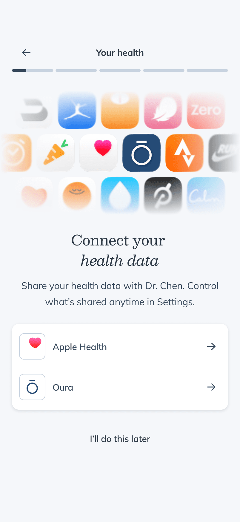
The wearable ask names the patient's actual provider — you're sharing with Dr. Chen, not with a company 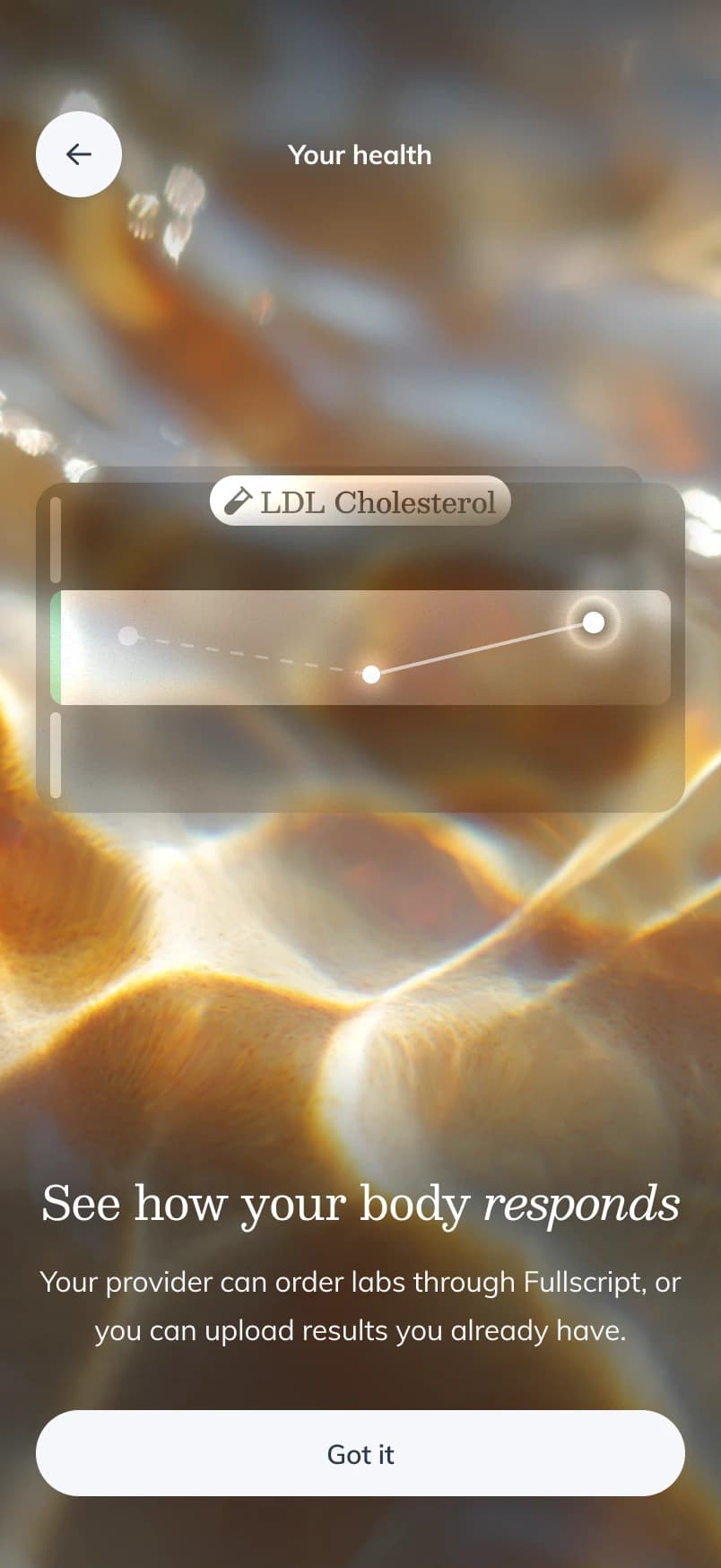
The labs moment sells the payoff of testing — seeing how your body responds — before any ask The skip I removed
The team's own playbook says never trap a patient in a guided flow without an exit. But the goal question the flow was built around depends on a genuine answer, and an escape hatch invites the "I'll do this later" non-answer that defeats the point. I removed skip on the goals screen alone — the sanctioned out is a "Prefer not to say" option — and kept every other screen skippable.
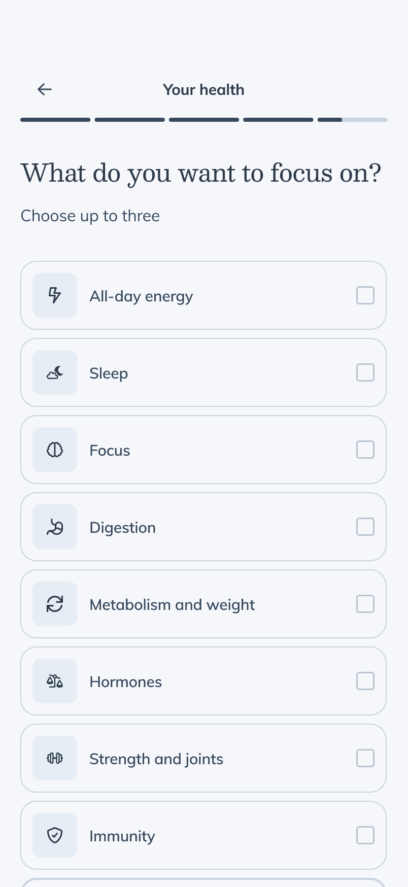
One question, up to three answers, and no skip. The way out is answering, or "Prefer not to say" 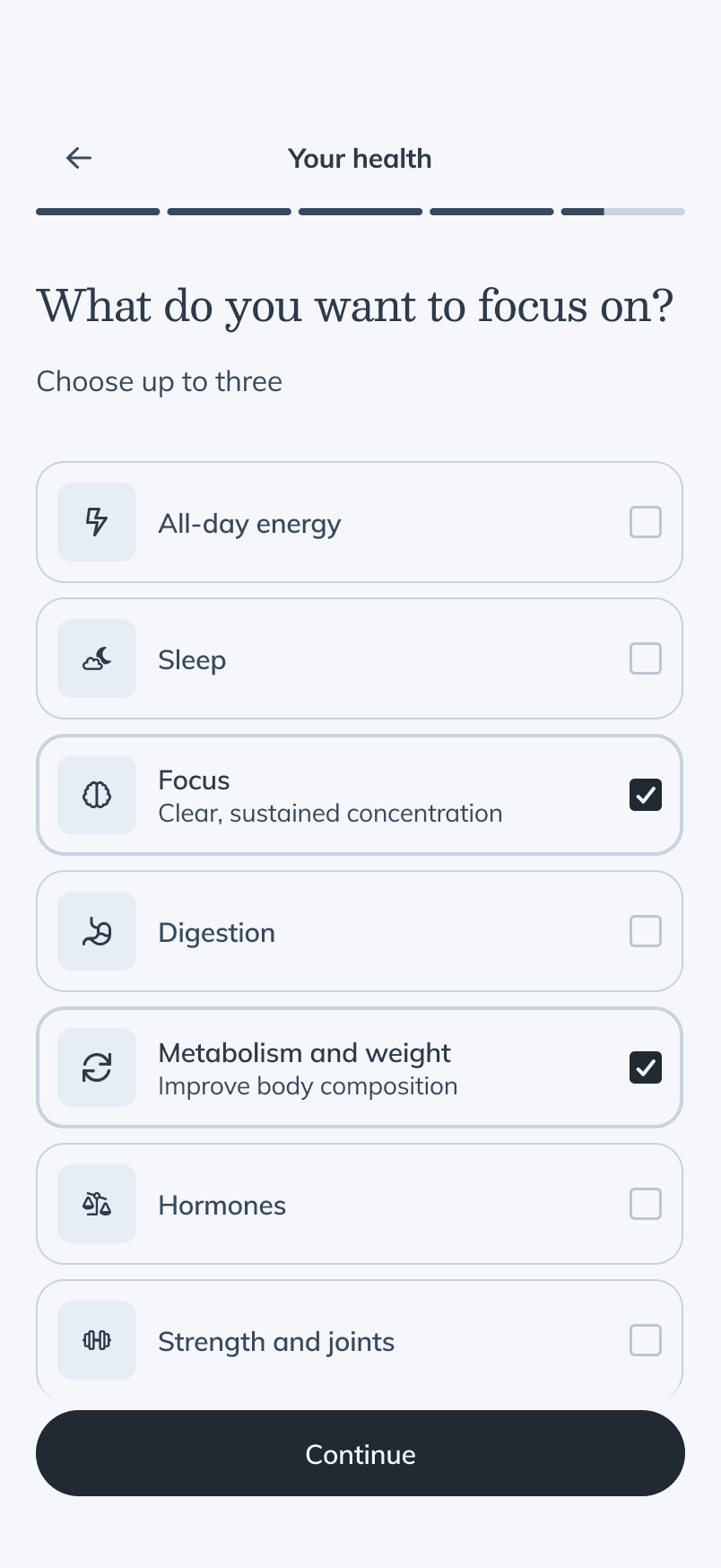
Selecting a focus reveals what it means, so confirming teaches instead of checking a box The tradeoff showed up in the response: one 2-star patient review and a few practitioners worried the ask read as overstepping, against two-thirds of 22,400 patients naming a real goal.
Four screens, not a form
Goals, age and sex, wearable connection, and routine setup could have shipped as one "complete your profile" step. I gave each its own screen instead, one question at a time. That meant more screens to build, test, and instrument, and the whole flow still finished at a 1.1-minute median, well under the 2-minute target.
The notification bet
The old flow asked for notification permission the instant a patient logged in, and converted 13.5% of asks. The product carried a scar here: an earlier feature had died not because practitioners rejected it but because an unrequested email fired on every edit — noise killed the loop. The lesson stuck: notification design is the product.
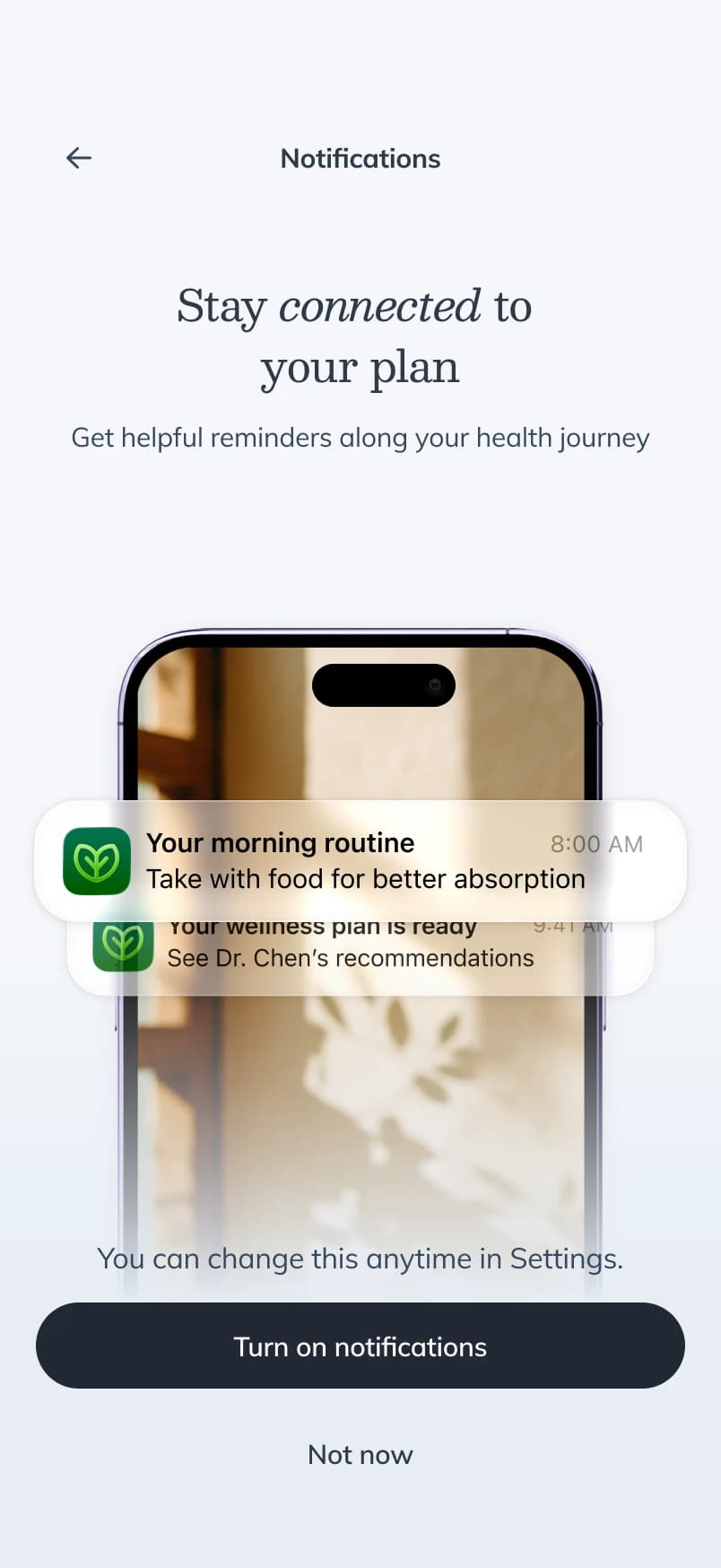
The ask moved late, after the patient has a routine to be reminded about, and shows the actual notifications they'd get A real control group
A phased rollout would have been easier; our analytics partner made the case for a true holdout instead, and he was right. The flow went live in June to a quarter of patients, with a matched control who never saw it — the only reason the results below are trustworthy.
Outcomes and impact
~+8 pts30-day plan conversion
Patients with an unpurchased plan, vs the holdout control. +7.7 pts at 7 days; p < 0.0001.
1.1 minMedian completion
Against a 2-minute target.
155%Routine setupof baseline
Correlates with a 70% higher reorder likelihood.
15,000Stated health goals
A profile asset that didn't exist before — two-thirds of patients who reached the screen named one.
Average order value didn't move — every point of lift came from more patients converting, not bigger baskets. Wearable connections ran at 5x the existing entry point's rate.
What missed
Two misses: notification enablement regressed — 9.8 per 100 against the old flow's 13.5 — because 92% of patients never scroll to the buried ask, though 97% of those who reach it say yes. The platform's numbers make that costly: a plan notification is the best-performing message it sends, clicked about fifty times more often than a promotion. And only a third of unpurchased-plan patients finish the flow — for non-converters it ends where the purchase decision does.
Where it stands
The 40-day reorder analysis came back clean, and at the end of July the team aligned on releasing the flow to every patient. The open questions have become other teams' roadmaps: a re-entry path for patients who abandon at the purchase decision, merchandising against the stated-goals data, and where the notification ask earns its best yes.
The next fight is web
Web still has no equivalent entry experience, and the platform has since sized that gap: patients who start in the app reorder about 12% more often than web starters, and they place more orders a year rather than bigger ones. The difference is frequency, not basket size — which is exactly what an entry experience moves.
Designing the way back in
Getting patients to their plan fast was the right bet, and for the two-thirds who don't buy, it's also where the flow ends. Next time I'd design the way back in at the same time as the way through.
Thanks
- Max Silverbrook — Drove the product framing, worked the content design with me, and wrote the readout that got this to full release.
- Yamato Murakami — Led the build and untangled the variant routing.
- Alexander Li — Made the case for a real control group when a phased rollout would have been easier, and did the conversion analysis that made the results trustworthy.
- Santiago Vera — Built the dashboards and ran the 40-day reorder analysis behind the release decision.
- Andrew Hillier — Pushed us to A/B test everything. He was right.
- Kelsey Bowman — Scoped and directed the flow's two animations with me.