Designing a physical product category from zero
Fullscript's first physical product: personalized supplement packs. I designed it from zero; patients bought them, but too few practitioners tried the builder, and it retired after 18 months.
Product Designer — Team Cura · November 2022 – October 2024
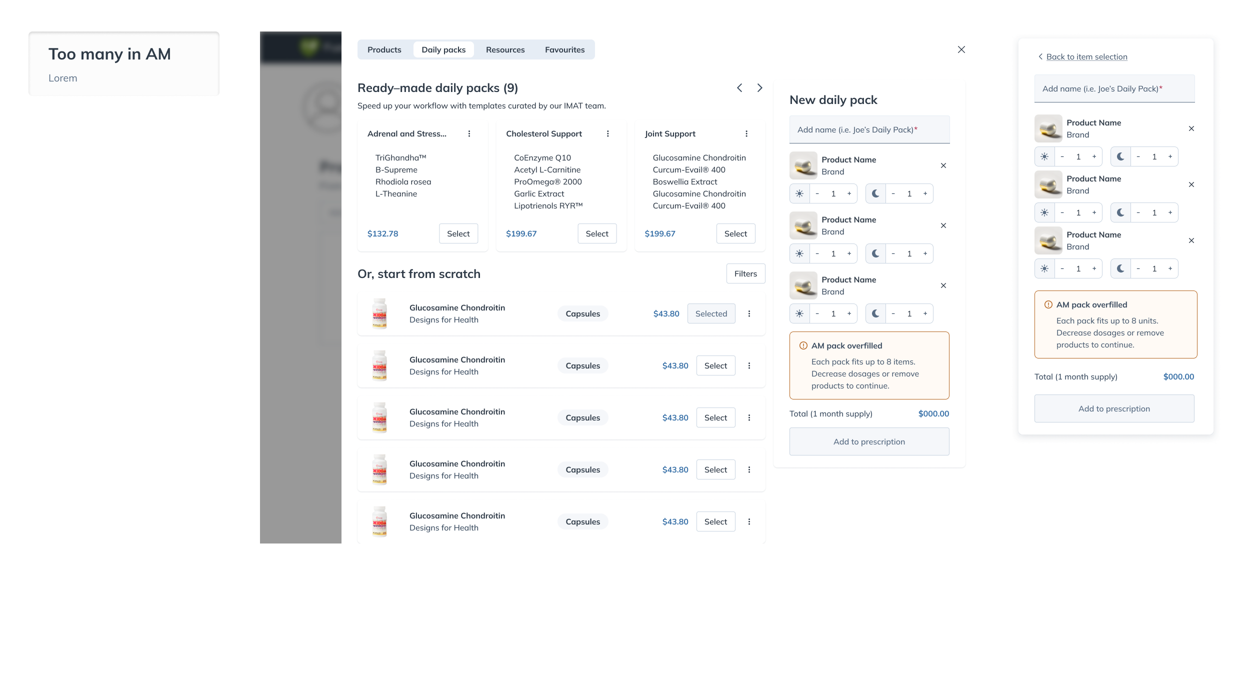
Patients on a supplement regimen manage a countertop of bottles — 37% reported re-ordering problems, 31% couldn't sort which pills to take when — while practitioners wanted the opposite of a catalog: "exactly what is needed for my patient. No more, no less."
I did the segment research and mapped the flows first, then designed the whole surface of a physical category: a pack builder inside the prescribing flow, new product pages, packaging, and shipping copy. Getting there meant giving up catalog integration in exchange for a direct path into a draft plan.
Patients ordered their packs at a higher rate than comparable first recommendations, and practitioners who tried the builder kept using it. Getting them to try it the first time was the part I never solved. The category ran 18 months and was retired in October 2024, at its highest-volume month.
A product with no product brand
In late 2022 Fullscript decided to sell something it had never made: its own product, personalized strips of daily supplement pouches filled and shipped under the Fullscript name. A fulfillment partner handled the physical side, but the agreement required the whole experience to read as native Fullscript — no co-branding to lean on, no partner documentation to link out to. The design surface was the product.
The demand was already on record. Practitioners recommending 3 to 6 products per patient wanted exact-dose regimens without brand-hunting — "I want to create 'just right' formulas that involve the exact dosages I recommend" — and a third of patients surveyed struggled with re-ordering, portability, or remembering what to take when.
Who it was for, before the first sprint
I wrote the relevance boards that defined who this was for — virtual prescribers, where 42% of prescriptions carry exact dosages — and mapped the four core flows before the first build sprint. When the product pages needed a spec, I wrote the requirements doc myself; the release notes credit it by name.
The cut that cost us
Early explorations put packs in the catalog, and we cut that to reduce scope — custom packs exist per practitioner, a concept the search infrastructure couldn't hold. Packs shipped in their own tab instead, with a direct action that opens a draft plan. It was the buildable option and the invisible one: nobody could find packs, and most of my later work went into buying back what that cut cost us.
The practitioner is the brand
A first-party product with an invisible fulfillment partner needs a trust anchor, and leading with a brand nobody knew meant explaining a brand nobody knew. So the person patients already trust does the explaining: "Personalized for you by Dr. {Name}" replaced the brand line, backed by an Only on Fullscript badge and a product page generated per patient.
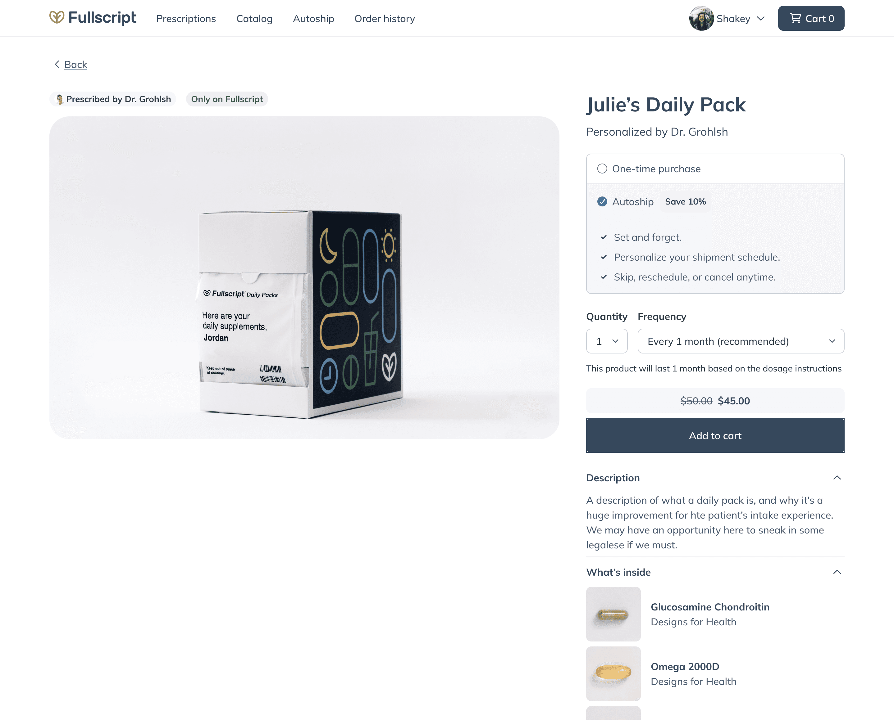
A product page generated per patient — the practitioner's name where a brand would be, both prices up front, and photography that shows exactly what's inside The physical world pushes back
The fulfillment facility could print 27 characters, legal owned what a practitioner could type as a pack name, and inventory was fragile enough that we held back a whole pilot wave for it. Personalization kept meeting physical limits — the print constraint cut practitioner names from the booklet one day before launch.
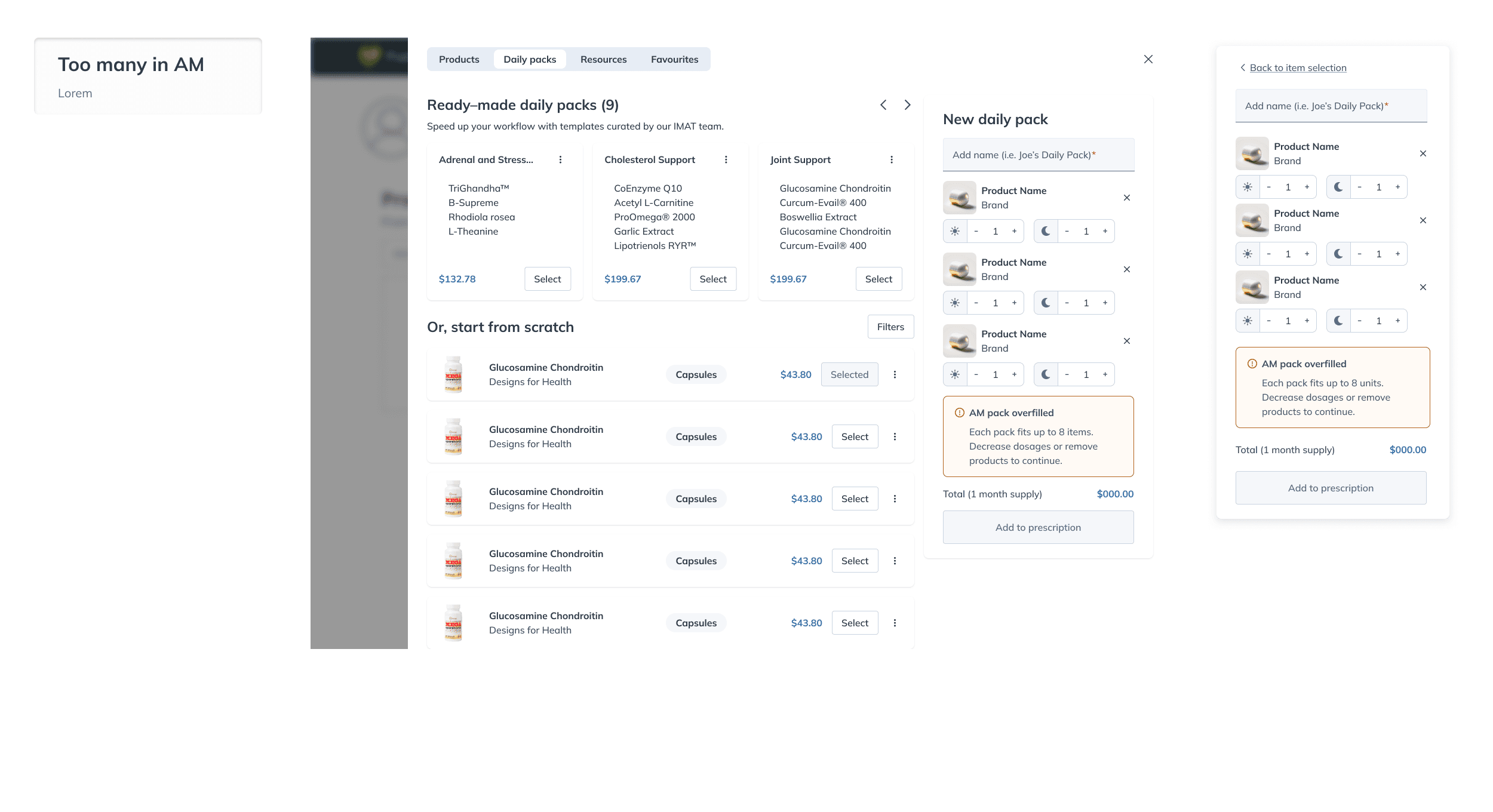
The builder enforces the physical product as interface — template starting points, a pill catalog, and a pack that refuses to overfill: at most 8 units fit a pouch Shipping on instinct
Three people, an unprecedented category, and no live users to test against — formal studies would have burned weeks testing guesses. We built the first version on judgment and measured everything once it was live. A dress rehearsal placed real orders through the pipeline in May 2023, then 50 practitioners, then 400 by mid-June, with every release killswitch-able in case inventory ran low.
Almost nobody prescribed it
Two weeks after the August launch the numbers were blunt: a handful of practitioners had explored the builder, and almost none had prescribed. Real usability truth arrived only after launch, and it said first use was the problem. Every design move that followed — a guided tour, an awareness banner, templates — targeted that first try.
The wrong pilot was the finding
Sales hand-picked 50 ideal-profile practitioners for wave one and got a single adopter out of them, while 350 randomly chosen accounts produced eighteen. Every holdout asked for the same thing — let me customize it — and that became the entire second release. When leadership paused templates, our memo reversed it within a week: the design was already done and kept component-fresh, which made saying yes cheap.
Outcomes and impact
≈55%First-plan conversion+7 pts vs comparable first plans
~1%Weekly prescriber adoptionagainst a 10% goal
The miss. First use, not retention, was where this fell down — about 15% of the practitioners who opened the builder became weekly users.
18 monthsCategory lifespan
Retired in October 2024, at its highest-volume month. That was a call about how the company wanted to operate, not a collapse in demand.
The practitioners who adopted it stayed — weekly prescribers tripled after launch, and by mid-2024 custom packs outnumbered the fixed formulas we started with, which is what the roadmap had bet on. But making and shipping a physical product cost more than a deliberately small pilot could carry.
The cut, measured
The invisibility problem outlived the product. Practitioners have since built hundreds of thousands of curated collections on the platform, and the platform's own numbers put all of them together at under 2% of direct order volume — because the overwhelming majority of patients arrive on a direct link to their plan and never pass a storefront at all. Same cut, same result, at a scale I couldn't have imagined.
Designed everywhere except the screen
A physical category is designed everywhere except the screen. The strongest re-order prompt we shipped was an empty pouch, and the deliverables that made this product real never appeared in a Figma file.
And the people who tried it stayed while almost nobody tried it. I spent the second half of this project learning that first use was the problem I should have designed for from the start.