Turning lab results into a conversation
A lab result without context either means nothing or scares someone. I designed the patient views that explain it and co-designed the practitioner builder; sharing grew every month.
Senior Product Designer — Patient Experience · April 2024 – February 2025
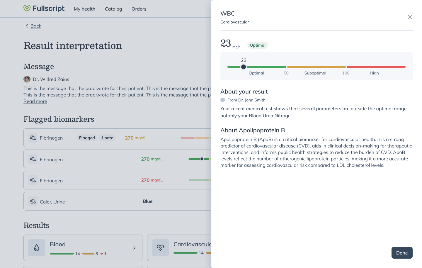
A lab result without context is a number that either means nothing or scares someone — and every diagnostics platform hands patients exactly that: values, ranges, and no translation.
I worked both sides of it — the patient-facing result views, and, with a staff designer, the builder practitioners write in — while a content designer set the rules for what the words could claim.
Practitioners kept sharing more of them month over month, and one told customer success the feature alone sold him on Fullscript as his labs partner.
Delivery isn't understanding
Fullscript Labs shipped result delivery in 2024, but the bet behind interpretations went further: if practitioners can attach context to every biomarker — where a value sits, what it means, what to watch — the result becomes a conversation instead of a document. Two users share the artifact: practitioners need to annotate fast enough to do it for every patient, and patients need to read it without clinical training.
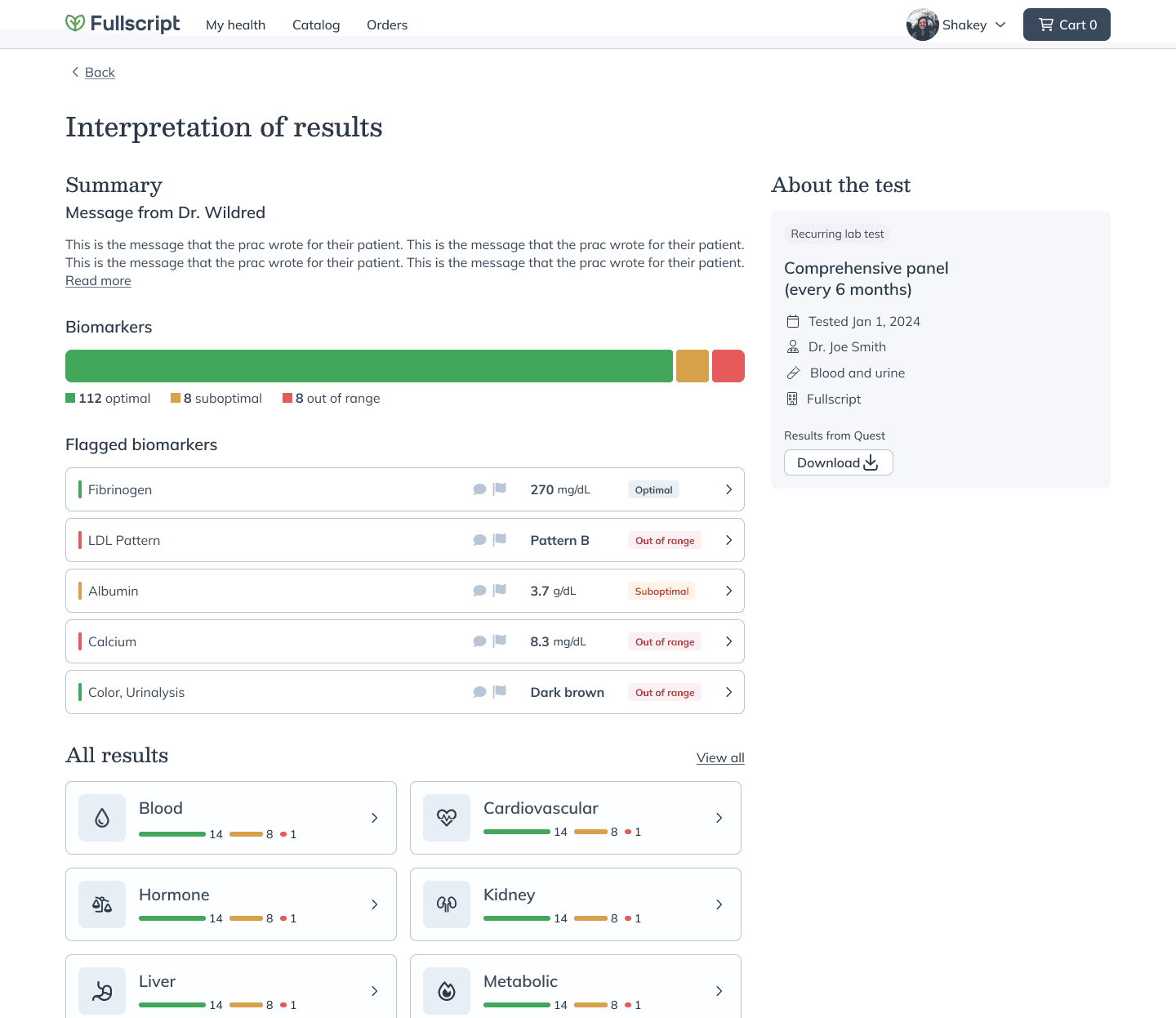
The patient summary opens with the practitioner's message, then the flagged biomarkers — context first, numbers second Making the range bar read everywhere
Every biomarker renders on a range bar — low, suboptimal, optimal, and back — in the Labs biomarker palette. The zones belonged to the clinical team; my work was making the same bar read correctly at card size, in dark mode, and for values that sit far outside any zone, where proportional rendering would break the scale.
One point can't trend
Showing a graph from the first result implies a direction that doesn't exist, and hiding it entirely risks patients assuming something is broken. In the biomarker-trends sessions I ran, a fabricated slope on a health metric lost to an empty state: the graph appears only once a biomarker has 2 or more results. A single result gets a deliberately written blank, because an honest blank beats a misleading line.
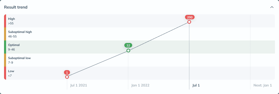
The trend graph appears once a biomarker has history — turning a number into a trajectory across the range zones 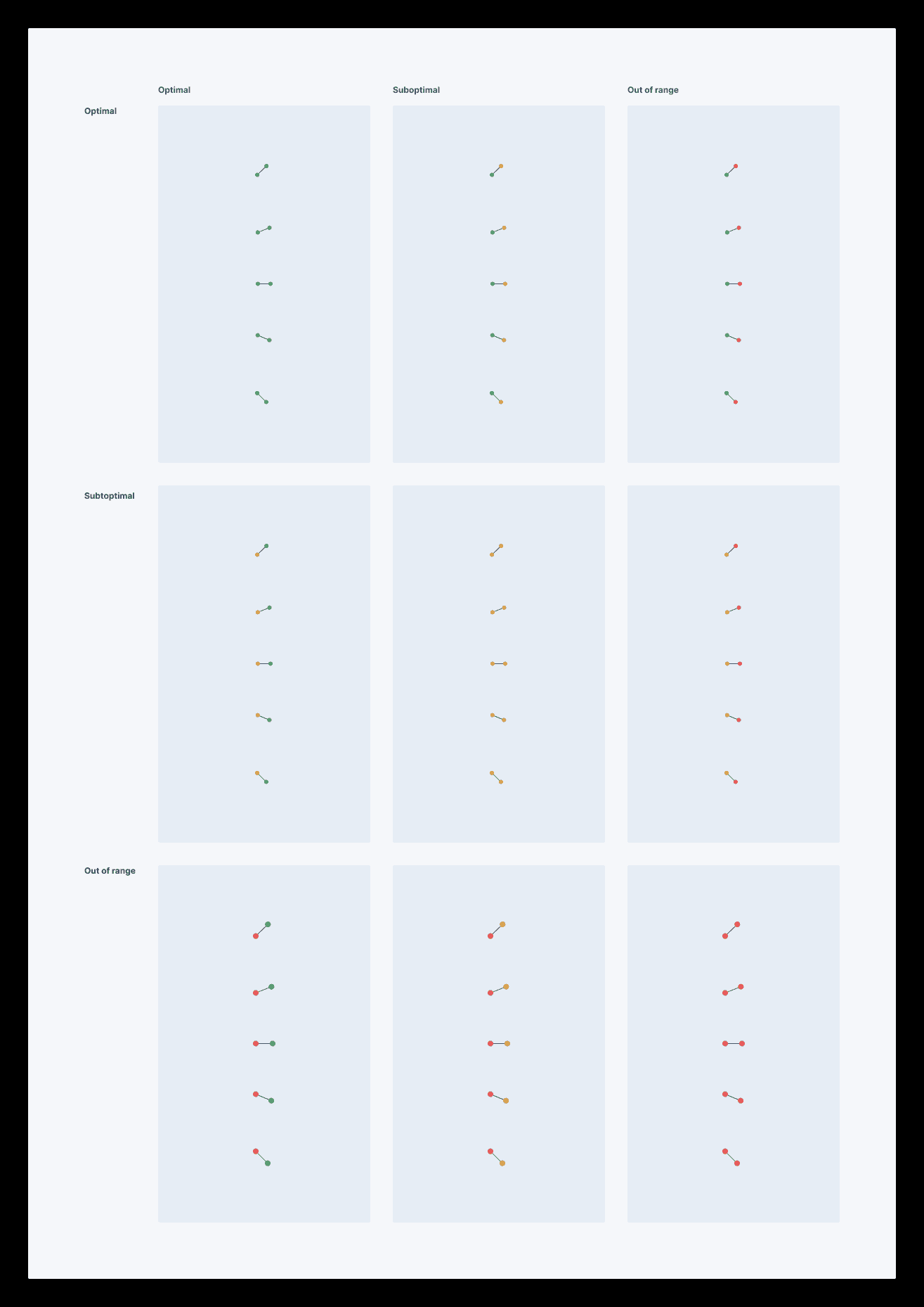
Trend-indicator variations, worked out as a set so every result pattern reads consistently — the detail that decides whether a trend is honest No 'good,' no 'bad'
Reassuring copy — "this looks good!" — is friendlier and tests well in isolation, but a biomarker's meaning depends on context only the practitioner has, and a cheerful label on a conditionally fine value is a claim the platform can't stand behind. The content designer's editorial rules held: no good/bad labels, no emotional framing, facts the practitioner can own. The copy reads cooler than consumer health apps, and trust here is clinical, not conversational.
The CMO said it wasn't ready
The hardest feedback in the project came from our chief medical officer, who said plainly that the early interpretation content wasn't ready. We rebuilt the summaries against the editorial rules instead of softening the wording around the problem, and the bar never dropped again.
AI in an editorial cage
AI-generated summaries made interpretation-per-patient feasible at scale, but an unreviewed generated sentence about someone's blood work is a liability, not a feature. So in the builder I co-designed, AI drafts against the editorial rules, and the practitioner reviews, edits, and owns every interpretation before it reaches a patient. Review adds a step to their flow — the practitioner's name is on the note.
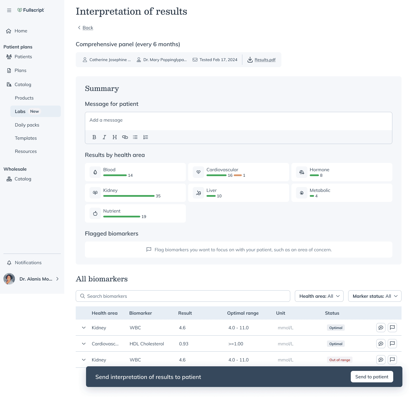
The practitioner builder I co-designed: annotate a biomarker, write the note, and send the interpretation to the patient in one flow The cage was the feature
The platform has since priced that bet: plans built with its AI clinical support carry more than twice the recommendations of a practitioner-authored one, and they convert at roughly half the rate. The friction even has a name now — information overload. AI is good at generating more of something; review wasn't the tax on it.
From one panel set to every Quest test
Interpretations entered production in August 2024, AI-drafted summaries followed in September, and coverage expanded to every Quest test in October — the same month Fullscript acquired Rupa Health. Auto-sending arrived in early 2025, so a finished interpretation reached the patient without the practitioner remembering to send it.
“Interpretations and trending is wonderful… I'm registering tonight!”
Practitioner — comparing lab platforms, November 2024
Outcomes and impact
Several hundredInterpretations shared with patients
About a hundred by December 2024, and several hundred by February 2025.
All Quest testsCoverage
Expanded from the initial panel set to the full Quest catalog in October 2024.
Interpretations became a reason practitioners said they chose Fullscript for labs — customer success passed along one who picked the platform because of the feature. What I can't tell you is how many patients read them: the feedback all came through practitioners, and nobody set up patient-side tracking while I was on the project.
Loved and invisible at once
Months after launch, a practitioner who gave Labs a glowing testimonial turned out to be managing results in a spreadsheet; she didn't know interpretations existed. Getting found is its own design problem, and launching a feature doesn't solve it.
Four weeks to four days
The patient-side number still isn't mine to quote, but the clinical loop is measurable and it moved. Two years on, the platform puts the gap between a result landing and a patient holding an interpretation at about four days, down from about four weeks, and the whole diagnostic journey at less than half its old length. The lab was never the bottleneck; the wait was for a clinician to explain the result.
The clinical team owned what the zones were; I owned how they read. Keeping that boundary explicit kept design debates about legibility instead of medicine — the version of the collaboration where everyone argues their own expertise.