Fullscript Labs
Fullscript took on the diagnostics category leader. I designed the patient side, from discovery to GA. Labs series, part 1.
- Role
- Product Designer — Patient Experience
- Timeline
- November 2023 – October 2024
- Team
- 1 Staff product designer (design lead, practitioner side) · 1 Product designer, patient side (me) · 1 Content designer · 2 Product managers · Clinical advisors (integrative MD, dietitian)
- Scope
- Patient experience · Order status system · Result delivery · Waitlist and demand funnel · Biomarker color system · Web + mobile
My role
- Designed the patient-side experience end to end: result delivery, order tracking, and discovery, across web and mobile.
- Built the status map covering 9 order states across 3 phlebotomy types — adopted by the team as the source of truth for every patient and practitioner status.
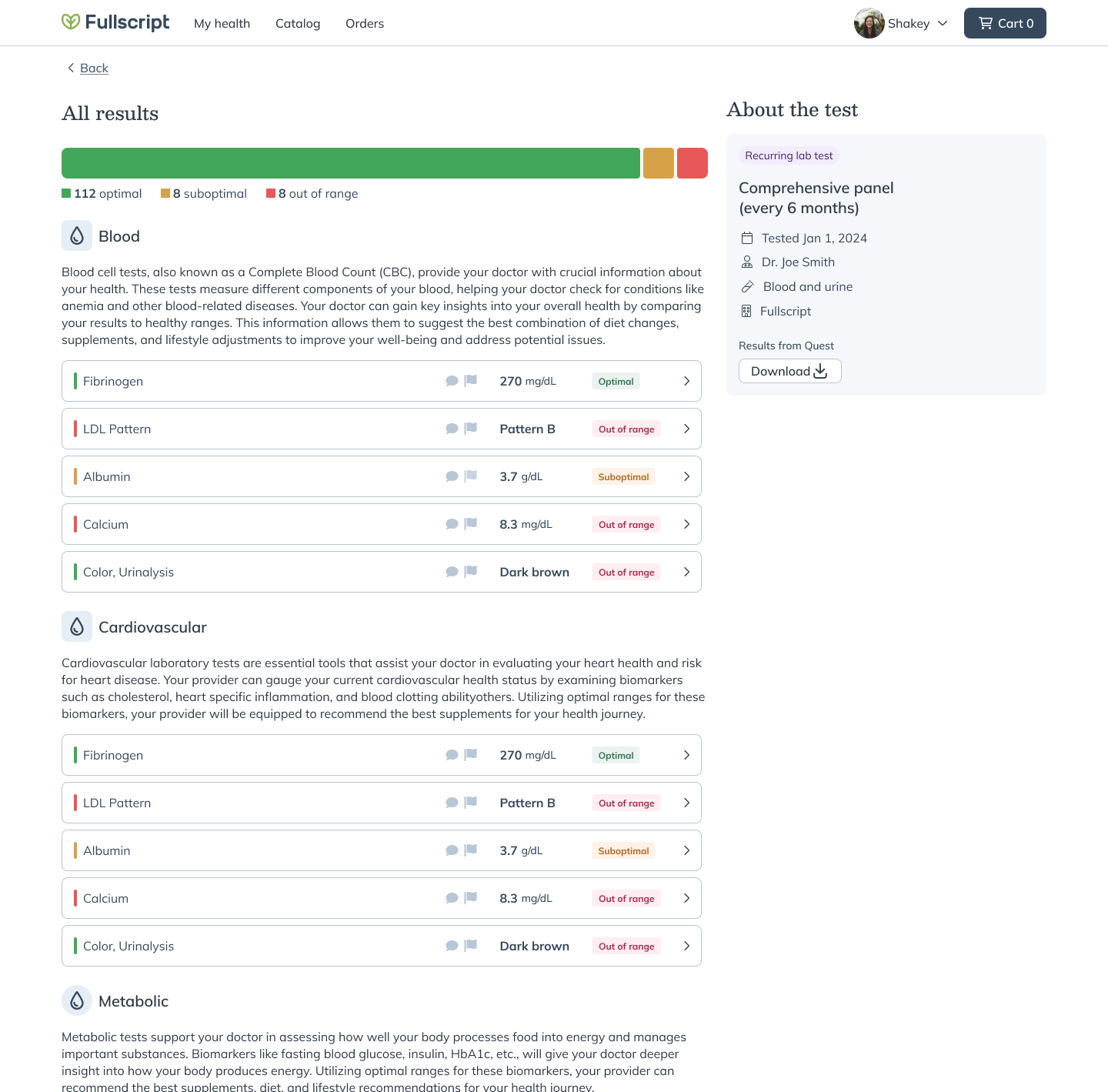
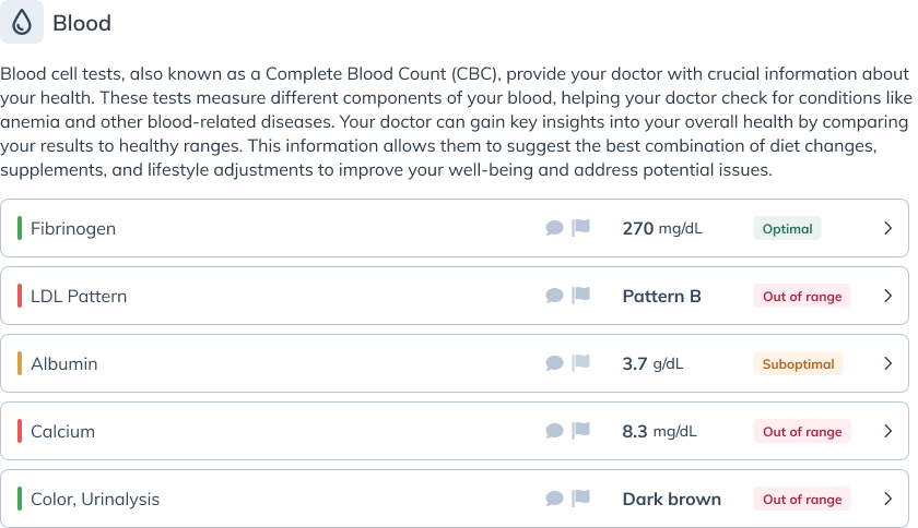
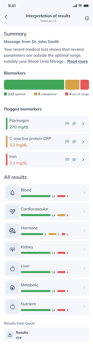
- Created the biomarker color system for MVP, optimized for legibility in light and dark modes; it became the standard across later Labs features.
- Proposed and designed the Labs waitlist — the demand signal that sequenced the rollout to general availability.
- Designed the practitioner-browsing experience that let patients find Labs-enrolled practitioners.
- Worked with clinical advisors on how results should read to people without clinical training.
TL;DR
In short
Problem
Integrative practitioners order diagnostics with every treatment plan, but that business ran through a competitor’s platform — and patients received the most clinically significant moment of their care as a raw PDF in a separate portal.
Approach
Mapped every state a patient passes through before designing a single screen, built the demand funnel in parallel with the product, and shipped from a 50-practitioner pilot to general availability in 6 months.
Outcome
More than 10,000 waitlist signups before launch, 3,319 practitioner registrations at GA — and 2 weeks before GA, Fullscript acquired Rupa Health, the category leader Labs was built to compete with.
Context and problem
The situation we walked into
Business context
Fullscript’s core business is supplement prescribing, but integrative medicine practitioners treat the whole patient: diagnostics and supplements go hand in hand. That diagnostics business ran through established lab platforms — with Rupa Health the category leader. Labs was the company’s top bet for 2024: build a first-party diagnostics product with no existing playbook, no integrations to build on, and no design system for biomarker data.
User context
Patients receiving lab results face a specific communication problem: numbers without context are either meaningless or anxiety-inducing. A TSH of 2.4 mIU/L means nothing to most people. And results are the end of a long arc — getting ordered, booking a draw, going to the lab, waiting — where each state demands its own design response. Patients spend most of their time with a lab order waiting, not reading.
Constraints and complexity
Nine order states across 3 phlebotomy modalities made for a combinatorially complex status system that had to be exact. Biomarker reference ranges vary by lab, age, sex, and clinical context, so the design had to hold that ambiguity without inventing false confidence. The patient app was young, patient-side analytics were thin, and the clinical ranges themselves were owned by the clinical team — my job was how they read, not what they were.
Goals and success metrics
What success looked like
A patient who receives lab results through Fullscript understands what they mean, knows where their order stands at every moment, and returns when the next test is ordered — while practitioner adoption proves the platform bet.
Success criteria
- Pilot live to ~50 practitioners by April 30, 2024.
- General availability within 6 months of pilot.
- 3,000+ practitioner registrations by GA.
- Waitlist demand strong enough to sequence the rollout.
Approach
How we got there
- 01
Mapped the journey before the screens
Started with low-fidelity flows covering the full arc from order to result. The exercise surfaced 9 distinct in-between states — draw scheduled, processing, results pending — that had no shared terminology across design, product, and engineering. Naming and sequencing those states became the project’s first deliverable, before any UI existed.
- 02
Made the status map the team’s source of truth
Built all 9 states across mobile phlebotomy, lab visits, and in-office draws into one map. It had to be exhaustive rather than illustrative: engineering wired state transitions from it, and when teammates needed to answer a status question, they were pointed to the map. It stayed the team’s reference for patient and practitioner statuses well past launch.
- 03
Created the biomarker color system for MVP
Explored an optimized palette for biomarker results and pitched it with a before-and-after: legible at card size, calm rather than alarming, and working in both light and dark modes where system colors fail. The clinical team defined what the ranges were; the palette defined how they read. It shipped with MVP and became the standard for every Labs surface after.
- 04
Seeded demand with the waitlist
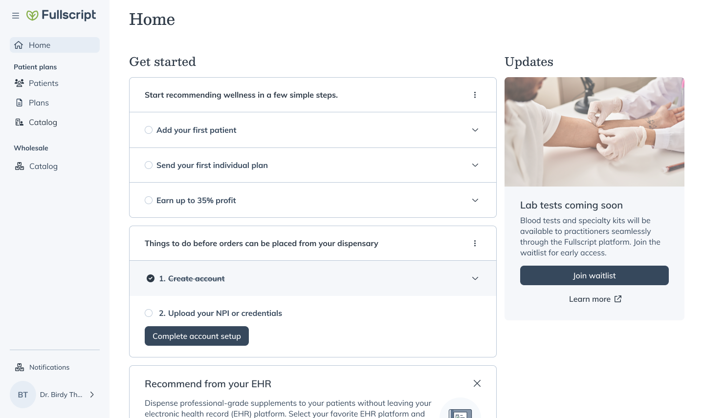
Proposed and designed the Labs waitlist — including the “you’re #N in line” mechanic — so demand could be measured before supply existed. Signups became the sequencing tool for rollout: the August 13 release went to 7,500+ waitlisted practitioners, the biggest release to that point, with more than 10,000 signups collected by that week.
- 05
Iterated from pilot to GA
The pilot opened April 30, 2024 with roughly 50 practitioners. Through the summer the team expanded coverage and polished patient surfaces release by release, reaching general availability on October 25, 2024 — 3,319 practitioner registrations in, with 671 arriving in GA week alone.
Key decisions
Forks in the road
9 distinct states vs a simplified 3-state model
A 3-state model (ordered, in progress, complete) ships faster and costs less to maintain. But a lab order can sit for weeks in states the patient can’t see — draw booked, specimen in transit, partial results — and a catch-all “in progress” leaves them guessing at exactly the moments anxiety peaks.
- Decision
- Built all 9 states with specific copy and visual treatment for each, across all 3 phlebotomy types.
- Tradeoff
- More design and engineering complexity up front, in exchange for a patient who always knows where their order stands.
A bespoke biomarker palette vs design-system colors
The design system’s semantic colors were the default path: free to adopt, consistent with the rest of the app. But biomarker results have their own semantics — a flagged value isn’t an error, and a borderline value isn’t a warning — and the system colors broke down in dark mode and at the small sizes result cards demand.
- Decision
- Created a dedicated biomarker palette, tuned for light and dark modes, and proposed it to the design-systems team with a before-and-after.
- Tradeoff
- A bespoke ramp to maintain outside the design system — accepted because reading a result calmly matters more than palette economy.
Waitlist as demand signal, not a gate
A hard gate — no access until your practitioner is enrolled — was the cleaner product logic. But it would have hidden exactly the data the rollout needed: where demand was, how intense it was, and which practitioners to enroll next. A signup that promises a place in line converts curiosity into a measurable queue.
- Decision
- Designed the waitlist to collect and rank interest rather than block access, with position-in-line feedback.
- Tradeoff
- Expectation-setting became a design problem of its own, in exchange for a demand curve the team could sequence releases against.
Solution
What we shipped

Outcomes and impact
What it moved
Waitlist signups
10,000+
Collected before general availability; the August 13, 2024 release went to 7,500+ waitlisted practitioners.
Registrations at GA
3,319
Practitioner registrations by general availability on October 25, 2024 — 671 in GA week, 108 activated within days.
Q2 2025 registrations
+54%
vs target
Labs registrations exceeded the Q2 2025 target by 54%.
Category leader
Acquired
Fullscript acquired Rupa Health on October 10, 2024 — 2 weeks before Labs reached GA.
Business impact
Labs was built to compete with a category that already had a leader. Six months after the pilot opened — and 2 weeks before general availability — Fullscript acquired that leader, Rupa Health, making the combined company, in its public announcement, one approaching $1 billion in revenue. The product the acquisition folded into kept growing: registrations beat the Q2 2025 target by 54%.
User impact
Patients receive, read, and act on lab results inside the platform they already use with their practitioner — no separate portal, no raw PDF. The status system answers “where is my order” before it gets asked, and the biomarker palette this project introduced became the visual language for every Labs feature that followed.
In their words
What people said
“It’s worth waiting for this. You all create just such good experiences. I knew as soon as I saw the waitlist I had to get on it.”
Practitioner — evaluating Rupa vs. Fullscript, August 2024 “Fullscript’s labs offering has been a game-changer for my business as I can order nearly any lab that my clients need. I am now able to practice at a level that I am so proud to offer my clients, as they don’t have to go anywhere else for their biomarker measurements.”
Jenna Braddock — RD “The board literally applauded when they were updated about labs today. So much of that is what you all did.”
Neil Shah — Product Manager, Fullscript Labs — May 2024 “Emile’s fingerprints are all over some of our most impactful work.”
Neil Shah — Product Manager, from Emile’s promotion announcement “You bring strong product design intuition, you move quickly from ambiguity to direction, and you consistently raise the quality bar through thoughtful craft and decision-making.”
Ben Walters — VP and GM of Labs, Fullscript
Learnings and reflections
What I’d take with me
The most-used design artifact had no UI
The status map — a diagram, not a screen — outlived every mockup. Support and product used it to answer status questions, and engineering built state transitions from it. When a teammate called it “the accurate one,” that was the moment the map stopped being documentation and became the product’s backbone.
Patient anxiety lives in the in-between states
In a product with a multi-week lifecycle, patients spend most of their time waiting, not reading results. Designing specific copy for each of the 9 states — instead of a catch-all “in progress” — did more for patient trust than any result-screen polish.
Owning one side of a two-sided product is a strength
I designed the patient side while a staff designer led the practitioner side and a content designer held the language across both. The clean split let 3 designers ship a company-scale bet in months — and made it obvious who to pull into any given jam.